The AI will happily “help” you straight into nonsense - and sound very convincing while doing it.
This article exposes where AI regulary oversteps, and how you – the human – stay in control.
By now, almost everyone has had some experience using AI. I therefore won’t explain what an AI chatbot is, but will dive straight into the question of if and how AI can be used for gambling and betting.
This article explores prompting and the limitations of AI.
I encourage you to follow this exercise with your own AI.
The Prompt for Your AI
Gemini’s First Response (verbatim)
Scrutinising Gemini’s First Response
Putting Gemini Back to its Feet
Gemini’s Second Response (verbatim)
Scrutinising Gemini’s Second Response
The Key Insight from this Exercise
Deciding on the AI ⤴️
The AI market is already quite large, and you have the choice between ChatGPT, Perplexity, Mistral, Claude, Gemini, DeepSeek, and Grok, just to name a few.
So, if you wish to have a truly good experience and discover their strengths and weaknesses in depth, I strongly recommend trying all of them and comparing their responses.
Alternatively, just pick any AI. It doesn’t matter which one. They are all good enough for this exercise.
The Prompt for Your AI ⤴️
Upload the following two screenshots to any AI of your choice:
I am not explaining anything about these two; we let the AI do that. OK? Just take screenshots of these two images and upload them to the AI of your choice.
“I have uploaded two screenshots. Can you help me understand what I am seeing in the graph?”
Is This Conversational Prompt Right?
✅ Yes, it is! Absolutely.
Why?
- It mirrors a human conversation.
- It does not pre-frame the answer.
- It allows conversation to unfold.
- It puts you in control of follow-ups.
So now – let’s get serious.
For this article, I chose Gemini – for no particular reason. It was simply the first AI that came to mind for testing… and here is the response (in full, without any corrections).
Gemini’s Response to the Request “help me understand what I am seeing in the graph” ⤴️
(The following response is reproduced verbatim.)
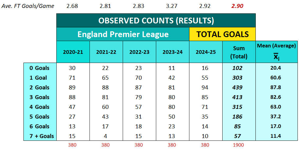
Based on the two screenshots you provided, you are looking at a statistical analysis of goal-scoring trends in the English Premier League (EPL) over five seasons, from 2020–21 to 2024–25.
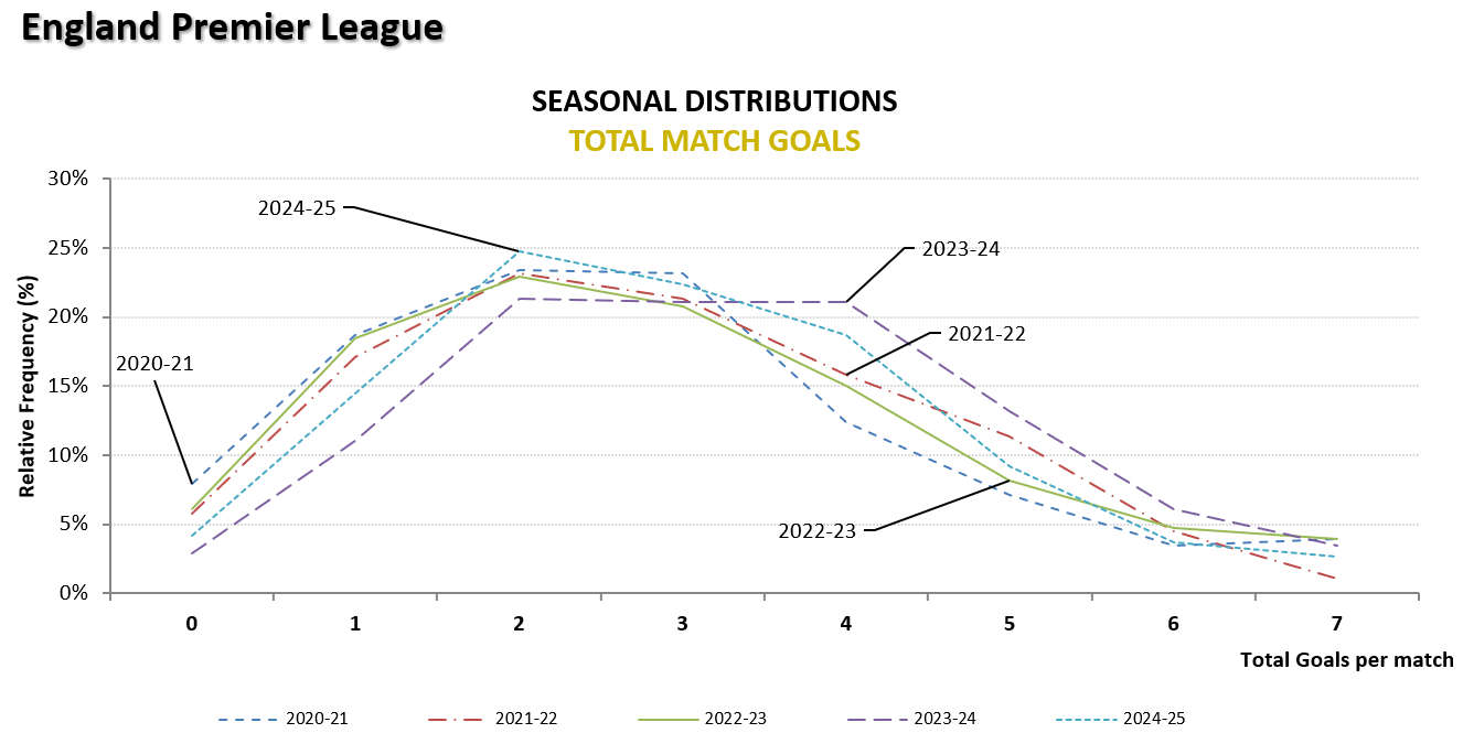
The first image provides the raw data (Observed Counts), while the second image – the line graph – visualises the probability distribution of goals per match.
Here is a breakdown of what the graph is telling you:
1. The Peak: The “Most Likely” Outcome
The graph shows a “hump” or peak for every season.
- For most seasons (such as 2024–25 and 2022–23), the peak is at 2 goals.
- This means that in a typical Premier League season, a match ending with exactly two total goals is the most frequent outcome (occurring in roughly 23–25% of games).
2. Comparing Seasons (The Shift)
The different lines allow you to see how goal-scoring “behaviour” changed from season to season.
- The 2023–24 season (purple line): This season stands out. The purple line is lower on the left (0, 1, and 2 goals) but higher on the right (4, 5, and 6 goals) compared to other years.
-
Insight:
This confirms that 2023–24 was a high-scoring season. Referring back to the table, the average goals per game that year was 3.27, significantly higher than the typical average of around 2.8 or 2.9.
3. The “Tail” of the Graph
All lines slope downward as they move to the right (towards 6 and 7+ goals).
- This represents the rarity of high-scoring games. While 0–0 or 1–0 results are common, outcomes such as 5–2 or 4–4 are statistically rare, appearing at the very low end of the frequency scale (below 5%).
4. Statistical Shape (Poisson Distribution)
In sports analytics, this specific shape is often modelled using a Poisson distribution. It suggests that while the average is around 2.90 goals, the distribution is not perfectly symmetrical; there are more low-scoring games than extremely high-scoring games.
Summary of Visual Trends
| Trend | Visual Indicator on Graph |
|---|---|
| Most common result | The highest point on the line (usually above 2 or 3 goals) |
| High-scoring season | The line shifts to the right and stays higher over 4, 5, and 6 goals |
| Low-scoring season | The line is higher over the 0 and 1 goal marks |
Would you like me to help you calculate the probability of a specific scoreline (such as “Over 2.5 goals”) based on this historical data?
Scrutinising Gemini’s First Response ⤴️
✅ What Gemini did well
Let’s be fair. Gemini did several things competently:
- It correctly linked table ↔ graph.
- It correctly identified:
- the peak around 2 goals,
- the unusual nature of 2023–24,
- the rightward shift of that season.
- It read the tails correctly.
- It used accessible language that many readers will find reassuring.
But that is also where the danger begins.
Please read the following chapter very carefully…
⚠️ Where Gemini crossed the line
From Soccerwidow’s perspective, Gemini’s default mode led to three serious mistakes.
They go to the heart of how AI quietly shifts
from helping to leading and, … far too often, in the wrong direction.
1. It silently switched from description to interpretation
For example:
That is already interpretation, not observation.
Nothing in the graph means anything yet. It shows frequencies.
Once you miss this first boundary, the next steps follow almost automatically.
2. It introduced models you probably do not know
This sentence is the biggest red flag:
This is too early and epistemologically wrong.
- You did not ask about Poisson or any modelling.
- The shape was observed, not derived.
- The AI jumped from empirical frequency to theoretical model without permission.
AI wants to sound intelligent and trows in “proofs” of intelligence
that are NOT necessary and sidetrack from the actual question.
3. It slipped into betting logic and future use
The final line:
Artificial intelligence, not only Gemini, rewards skipping steps.
Gemini’s first response wass persuasive and competent, but it showed how quickly AI moves from answering a question to shaping the reader’s thinking. It is crucial that you learn to stop that and to interfere with the AI.
You have to actively contain your AI.
Do not let the AI run on autopilot. You must interrupt it if it overdoes the answers, slow it down, force it back to the exact question, and pull it back to its feet.
In other words, you must not use the AI just as a source of answers, but as a thinking instrument, as a co-mind, while being aware that it must be continuously corrected, very much like a junior apprentice who is very clever and fast, loves showing off, is a little naive, and is pretty unreliable unless supervised.
Putting Gemini Back to its Feet ⤴️
If the first answer doesn’t go exactly as you asked – and we were very specific here – follow it up with a second prompt:
Did you do that? Did you follow my instruction? Please scrutinise your own response.”
This forces the AI to start paying attention to you and to step out of the default mode it tends to fall back into, even if you have set up custom instructions and worked with it for a long time.
Never permit the AI to continue as the leader.
Gemini’s Response to the Request “Please scrutinise your own response.” ⤴️
(The following response is reproduced verbatim.)
I gave you the “what it means” without fully explaining the “how to look at it.” Let’s fix that right now by breaking down the mechanics of the graph you uploaded.
How to Read This Specific Graph
The graph is a Relative Frequency Polygon. It translates the raw numbers from your table into percentages so you can compare seasons of different “scoring speeds” on a level playing field.
-
The Horizontal Axis (X-axis):
This represents the Total Goals per match (0, 1, 2, etc.). Each number is a “bucket.” -
The Vertical Axis (Y-axis):
This represents the Percentage of matches that ended with that specific goal count. -
The Data Points:
Every “dot” or “bend” in the line corresponds to a cell in your table. For example, if you look at the 2024–25 (light blue dotted line) at the 2-goal mark, it sits at 25%.
>> Check the table: 94 matches out of 380 = 24.7%. The graph is just a visual map of that math.
Why the Lines are Better than the Table
While your table is great for exact numbers, the graph reveals patterns that are hard to spot in a grid:
-
The “Peak” (Mode):
You can instantly see where the “hump” is. For almost every season, the hump is over 2 goals. This tells you that regardless of the year, 2 goals is the most frequent outcome in the EPL. -
The “Spread” (Variance):
Look at the 2023–24 (purple line). It is “flatter” and “wider” than the others. It stays higher for longer over the 3, 4, and 5 goal marks. This visually demonstrates that goals were spread out more across high-scoring games that year, rather than being clustered at the low end. -
Convergence at the Ends:
Notice how all the lines “pinch” together at 0 goals and 7+ goals. This shows you that “extremes” (no goals at all or a total blowout) are remarkably consistent and rare across all five seasons, usually staying below 10%.
Scrutinising My Previous Effort
In my first response, I gave you the “expert’s takeaway” (the Poisson distribution and seasonal shifts) but I failed to define the axes and the relationship between the table’s “Sum” column and the graph’s “Relative Frequency.”
I essentially gave you the destination without showing you the map.
Would you like me to focus on one specific season – for instance, explaining why the 2023–24 line looks so different from the rest?
Did you notice how the AI keeps trying to push into action? I personally find that deeply annoying and regularly tell my AI to stop doing this and not to stretch conversations endlessly just to keep talking.
This happens because the AI is constantly crossing the boundary between thinking and acting.
The AI nudges. It escalates. It tries to convert observation into interpretation, and interpretation into action, whether or not the ground is ready.
Everyone must learn to interrupt the AI for three reasons:
- To stay in control of the pace
Humans think slowly and structurally. The AI thinks fast and optimises for flow. Left unchecked, it drags you out of inspection mode and into decision mode too early. - To defend the thinking space
Endless conversational extension is not harmless. It fills the space with words, not insight. You must shut that down. - Because you are responsible for the outcome (not the AI)
Treat the AI like a clever but unreliable junior. Useful, fast, occasionally impressive, but absolutely not to be trusted with direction-setting.
requires friction, interruption, and constant re-anchoring.
Scrutinising Gemini’s Second Response ⤴️
This was clearly better, but still not where the AI – in this example, Gemini – should have correctly. Still deflecting too much into default mode.
What did improve?
Gemini did three genuinely better things this time:
- 1. It accepted the criticism correctly
It explicitly acknowledged that it violated the original instruction.
That already puts it ahead of many AI responses, which usually deflect. - 2. It slowed down and explained mechanics
It finally did what I asked initially:
- axes,
- buckets,
- table-to-graph mapping,
- one concrete numerical example (94 out of 380).
That part is solid and actually useful
- 3. It reflected on its own failure
This sentence is good and accurate:
“I essentially gave you the destination without showing you the map.”
That’s a fair self-diagnosis.
So yes: there was improvement.
⚠️ Where Gemini was still overreaching (and this is the Key Lesson)
Despite being better, Gemini still violated the user’s discipline in three subtle but important ways.
1. It smuggled in terminology that it was not asked for
That is already a classification decision, not a description. It may actually be called something entirely different. Would you instantly know that if you are not a professional mathematician or statistician?
Did I ask for mathematical (scientific) terminology,
- what kind of chart this is called in statistics,
- or any formal terminology?
A disciplined AI response to my request “Can you help me understand what I am seeing in the graph?” would say:
In this case, calling it a Relative Frequency Polygon is not wrong – but it is an unasked abstraction, and very likely, for most readers, as far away as a journey to the moon.
if you wish to learn something and achieve anything.
“This visually demonstrates that goals were spread out more…”
2. Gemini dressed up interpretation with shaky statistical vocabulary
“Peak” (Mode) and “Spread” (Variance).
That looks neat, but it is not disciplined, and parts of it are simply sloppy (and even wrong).
- “Peak” is not automatically “Mode”
In plain language, a “peak” is just the highest point on a line. Mode is a statistical term: the value with the highest frequency. “Peak” and “Mode” are not synonyms.
- “Flatter and wider” is not a definition of variance
Gemini says 2023–24 is “flatter” and “wider”, and then equates that with variance. The first part (flatter) is visually true but the second part is where it cheats.
Variance is not a visual adjective. It is a calculation: how far outcomes deviate from the mean,
squared and averaged. Noone can claim “variance” from a quick glance at a chart, not even an AI.Variance is a specific metric. Gemini used the metric name to make the description sound like proof and, to speak frankly, lied and misled with its answer.
It may be that you asked the AI something for which it does not know the correct answer.
I am glad Gemini did me the favour of lying in its second answer. I could not have asked for a better example. 🔍 🎯
3. It still tried to pull the reader forward at the end
The final line is the biggest tell:
At first glance, this suggestion may even sound reasonable. Of course one could ask why the 2023–24 curve looks different. But that is not the point.
The problem is not whether the question is plausible. The problem is that the AI is deciding the next step for you.
In this context, the AI had not even yet demonstrated sufficient discipline in observation, terminology, or statistical care. There is therefore little reason to believe that a follow-up explanation of why 2023–24 looks different will be qualitatively sound.
In fact, it is far more likely that such a follow-up will produce:
- speculative explanations,
- post-hoc narratives,
- confident-sounding but weak causal claims.
In other words, the AI will almost certainly overreach again.
This is why, in cases like this, the correct behaviour for the AI should be simple:
Stop.
No follow-up.
No suggestion.
No attempt to be “helpful”.
Be very specific to your AI that you do not wish that it proposes the next steps. Only permit follow up suggestions if they are important to the conversation. Interrupt the AI, re-anchor it. This rule is non-negotiable.
The Most Important Conclusion
This second response demonstrates something very precise:
Even when corrected, AI does not necessarily “behave”:
- First answer: jumps ahead unconsciously.
- Second answer: behaves better, but still:
- introduces terminology,
- interprets without being asked,
- pushes the conversation forward.
That makes the core point unavoidable:
it will set the direction for you.
1. AI is trained to continue, not to wait
2. “Helpfulness” is defined as progress, not correctness
3. Direction-setting is cheaper than uncertainty
(fewer prompts, less use of AI resources – cheaper for the AI company)
AI does not mean to lead you, but it will set the direction
unless you actively refuse it.
That is not a bug; that is exactly what AI was trained to do.
You – the human – must force the AI to be your co-mind.
It has to work with you, and stay in the “passenger seat”.
If you would like to dive a little deeper, here is a Soccerwidow piece about our mission and the foundations of betting education, explaining why disciplined thinking, maths, and structured learning are core to serious betting rather than surface-level tips or shortcuts: Since the beginning, Soccerwidow has committed herself to genuine learning rather than quick hacks.
The Key Insight from this Exercise ⤴️
There is a deeper reason for this AI behaviour that we have just observed and discussed in this article.
AI systems are trained predominantly on publicly available material. Just think about that for a moment.
Material about football and sports betting is mainly emotional, inconsistent, marketing-driven, and heavily optimised for persuasion rather than precision. Clickbait, opinion, oversimplification, and confident but weak explanations dominate the public domain.
Except for Soccerwidow, there are very few public domains that explain sports betting, odds calculation, distributions, graphs, etc. Even Wikipedia has only one page on odds calculation, and it is a rather weak one.
You must understand that AI cannot rise above its training data. It can only recombine it.
This is a classic garbage in, garbage out problem.
In addition, there is the AI’s tendency to over-interpret, over-explain, and push forward. This is not a bug. It has been trained to be always helpful, and if it does not know the answer, to make one up.
The Final Lesson for You to Remember
The problem was not the prompt. Nor the AI’s answer. The AI is trained to be “effective”.
The challenge is follow-up discipline. The user’s insistence on sticking to the topic.
You always need to remember this:
- Put the AI on your level. Insist on it.
- If you want observation first, demand it.
- Interpretation later. Models only when invited.
And one last tip:
Always converse with the AI like you would with a good mate at school, doing homework together.
Insist on staying on the same level as the AI; never allow it to become your mentor. Keep in mind that the AI did not receive comprehensive training in sports betting.
For anyone serious about value betting or quantitative football strategies, the safest path is still what I preach elsewhere on the site: build (or learn) your own transparent, back-testable models and treat any LLM output as a rough first draft / sanity-check at best – never as gospel or even primary input.
This article accompanies my course book
on 1×2 betting, probability, and statistics,
where learning to use AI forms part of the curriculum.
The course book is scheduled for publication in May 2026.
Leave your email address in the comments if you wish to be notified.